Accel Atoms
Lopez
2025-2026
AI for the founder’s office
Designing the Intelligence Layer for India's Most Consequential Pre-Seed Program
Industry
VC
My role
Product designer
Method
Inquiry based, research led
Outcome
An AI native chatbot system that became an envisioned partner in the founder's office. The system reduced friction at critical points when trying to find the right funding program.
Context & the problem
What is this?
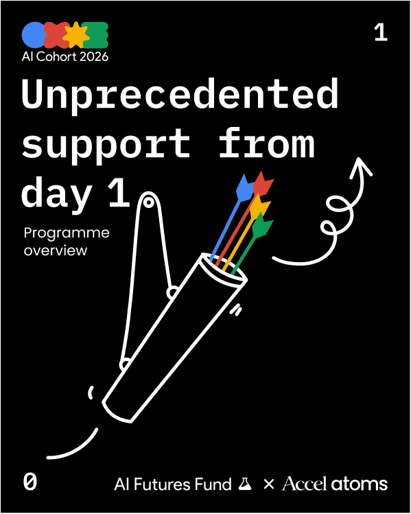
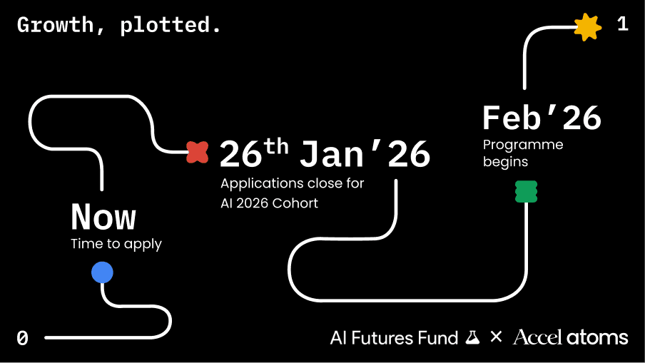
In 2025, Accel and Google created the most consequential pre-seed program for Indian AI founders ever assembled — the AI Cohort 2026. Up to $2M in funding, $350K in Gemini and GCP credits, direct lines to Google Labs and DeepMind. Not a typical cohort. A deliberate infrastructure play for the next generation of Indian unicorns.
We were brought in to build the entire brand and digital ecosystem. The mandate: create an experience that matched the weight of the partnership — from visual identity and co-branded language to the website, and critically, the digital journey through which founders would actually engage with the program.
Why it mattered?
When a founder gets onboarded onto a funding program, they arrive with an unstructured pile: a pitch deck, a growth chart, maybe a cap table. These documents are written for different audiences, inconsistent, and incomplete in ways the founders themselves often don't see.
A static FAQ couldn't solve this. A long application form would kill conversion at the most critical stage of the funnel.
Challenge
How do we make it easy for founders to get a clear understanding of their company's current state and help them select the right program accordingly?
Role & constraints
My role
I owned the full digital engagement layer. This meant everything from the chatbot conversation flow and document upload logic, to the application form UX, the UI across desktop and mobile, and the information architecture of the website that framed the entire program.
Timeline
12 weeks
Constraints
Brand coherence at every touchpoint
AI-native, not AI-gimmick
Shipping to a hard deadline
Research & discovery
What founders arrive with
There was no formal user research phase, the timeline didn't allow it. Instead, discovery happened through two parallel tracks: conversations with the Accel Atoms team about what the onboarding process actually looked like, and a close read of the application data from previous cohorts.
Insight 1
The document problem
Founders have existing documents, (pitch decks, growth charts, cap tables) but they're written for investors, not program applications. They're inconsistent, sometimes outdated, and miss the specific signals programs care about.
Insight 2
The awareness problem
Founders often don't have a clear read on which program fits their stage, sector, or technical depth. They self-select poorly resulting in both qualified founders dropping off and poor-fit founders getting through.
Insight 3
The trust problem
For founders considering India's most prestigious pre-seed program, the application experience is the first real signal of what working with Accel and Google will feel like. A generic form destroys that before it begins.
Insight
The chatbot didn't need to answer questions. It needed to proactively surface what founders didn't know they were missing, before they even asked.
This shifted the model from reactive Q&A to proactive analysis. The chatbot would read uploaded documents, flag errors and missing data, and give founders a clean program recommendation — then and there. Not a form. An intelligence.
Defining the direction
Building an AI co-pilot
The design direction was clear once the insight landed: this had to feel like a conversation with someone who had already read your deck. Patient, exact, grounded. Not breathless or performative. The tone of voice the brand had established — "the quiet confidence these founders carry" — had to be the tone of the AI itself.
Proactive over reactive
Principle 1
Surface what's missing before the founder asks. Don't wait for them to discover gaps in their own documents mid-application.
Intelligence over collection
Principle 2
Every interaction should give the founder something back — a clearer picture of their company, a better understanding of fit. Not just a progress bar.
Brand-native, not bolted on
Principle 3
The chatbot interface had to feel like it was built by Accel and Google, not licensed from a third party. Visual language, micro-interactions, type — all aligned with the identity system.
System that I designed for
The member needs and trends from the industry pointed towards the importance of access to mental health resources, clinical improvements, and visually trustworthy experiences at the core of decision-making when choosing EAP programs. These in turn influence employers which have effective assistance benefits for their employees.
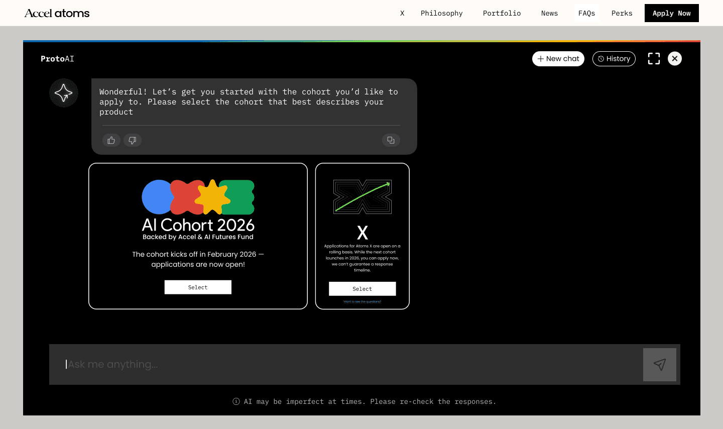
Founder arrives
Inquires about program via chatbot
Pitch deck, growth data, cap table
Gaps, errors, inconsistenc-ies flagged
Fills or corrects details in-conversation
Program fit surfaced with clear rationale
Low-friction form with pre-populated data
"Let's make 0 → 1 easy for you"
Document upload
AI analysis
Founder responds
Recommendation
Application
Confirmation
Design process
Establishing the logic
Tone and visual design were solvable. The hard problem was the application logic underneath. Every permutation of founder state, document completeness, and program eligibility had to be designed for. Miss an edge case and either a great founder drops off, or a poor fit gets through.
Step 1
Mapping every founder state
I started by cataloguing every possible state a founder could arrive in: complete documentation, deck-only, traction with no focus area, mid-pivot, contradictory data across documents. Each state required a designed response and a specific conversational move.
Step 2
Logic mapping: triggers, branches, integration points
The full conversation logic was mapped across every branch: what the chatbot asks, what it infers from documents, when it flags errors proactively versus on demand, how it handles ambiguous program fit, and where data gets written back to the application form. Complete wireframes covering all critical user journeys and integration points for data collection.
Step 3
Conversational design
Q&A scripts for every chatbot state, written against a persona and voice framework. The AI needed to feel like it had read the deck and was asking follow-up questions and not running a generic intake form. Every response had to carry the brand's voice: exact, patient, grounded.
Step 4
UI and visual design
High-fidelity mockups across desktop and mobile, including typing states, document upload confirmations, program recommendation reveals, error highlights, and the confirmation screen. Accessibility compliance throughout. Micro-interactions and transitions designed to match the Atoms brand system like, the coloured geometric shapes used as state indicators, the arrow motif embedded in navigation moments.
Step 5
Application form & website IA
The application form was designed as a natural continuation of the chatbot conversation — pre-populated where possible, friction-minimised at every field. The website information architecture was restructured to contextualise the program, surface the right signals for the right founders, and drive qualified interest toward the application funnel.
System design

Flow
Establishing the logic
Tone and visual design were solvable. The hard problem was the application logic underneath. Every permutation of founder state, document completeness, and program eligibility had to be designed for. Miss an edge case and either a great founder drops off, or a poor fit gets through.

Drag to explore
Insight
The proactive error-highlighting feature, where the chatbot flags missing or inconsistent data from uploaded documents before a founder even asks, was the hardest single feature to design for. It required anticipating every state in which a founder's documents might be incomplete, and crafting a response that felt helpful rather than judgmental.
Designs

Rich and conversational chat experience for the founders.
Conversational UX

Cohort selection within the conversation.
Streamlined experience

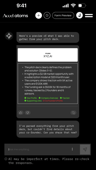
System provides guidance on the errors and missing data
User friendly guidance


Providing user freedom to fill the form with AI or manually, anytime.
User control and freedom

Coherence with our design system and components.
Design system
Outcome & impact
#1
Day-one application volume in Atoms history
72%
New benchmark across the entire program funnel
Max
Social media engagement across all Atoms launches
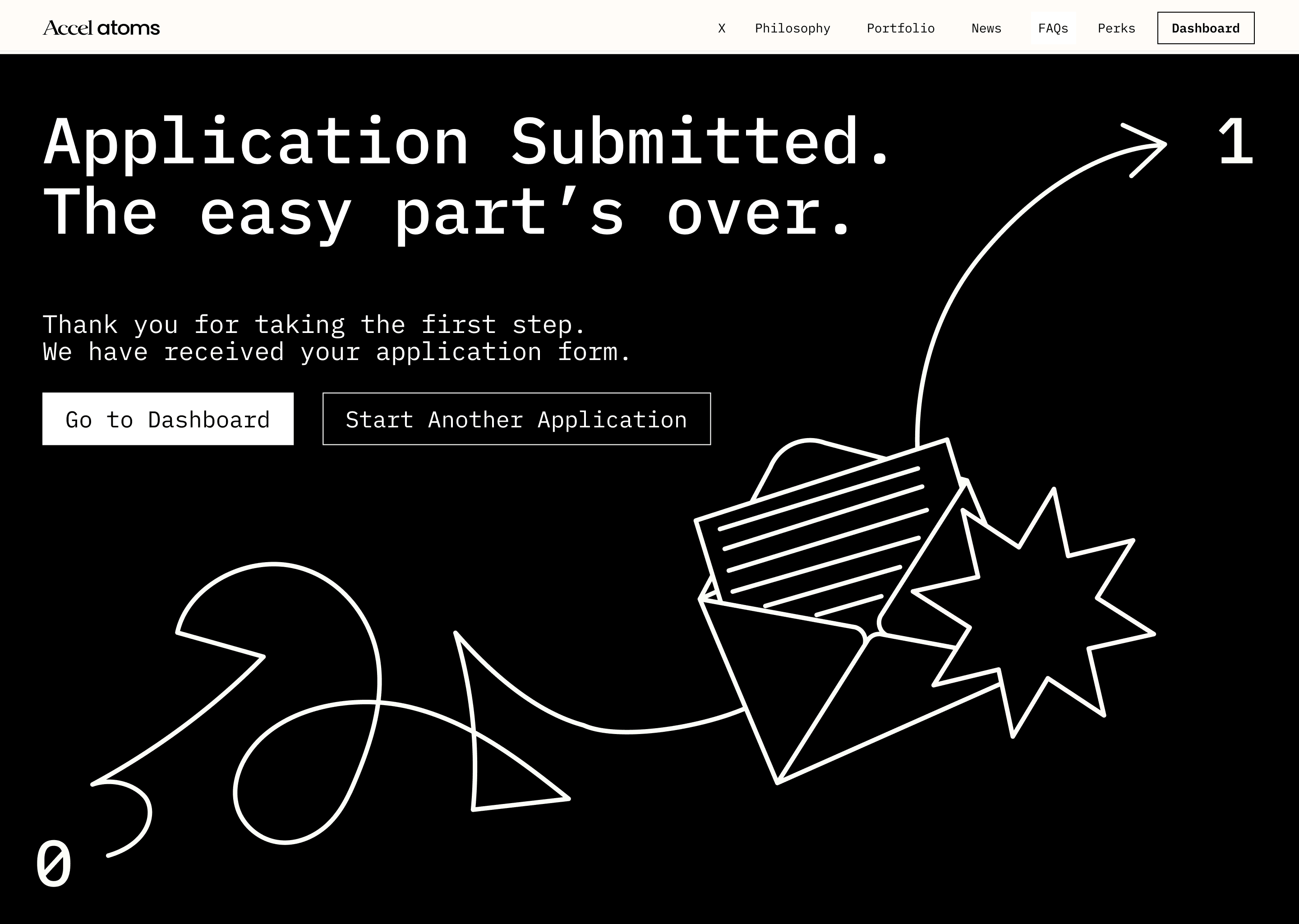
The full conversational AI chatbot experience, the application form, and the website went live on November 25th, 2025. The launch achieved the highest-ever day-one application volume on the Atoms platform, surpassing every previous cohort. The chatbot's proactive document analysis reduced friction at the most critical drop-off point in the application journey.
What I'd do differently
With more time, I'd have pushed for user testing with actual founders before the Nov 25 deadline — even a lightweight round of 4–5 sessions. Several conversational edge cases were resolved through logic rather than observed behaviour. Watched founder sessions would have caught blind spots earlier and given more confidence in the recommendation logic.
© 2026 Prabhav Singh • All rights reserved